Banner del proyecto eSignals

eSignals

eSignals is a mobile trading signals platform I designed end-to-end for Envision Signals, a startup backed by Envision Technologies, a team of proven financial experts and advisors. The product delivers AI-powered trading signals, market news, and a simulated portfolio so users can act on real opportunities without needing to monitor markets all day.

I owned the complete design process, product strategy, information architecture, branding, design system, UX flows, UI, and the marketing landing page. The app launched on both the App Store and Google Play.

Role

Product Designer

Type

Client Project - Live Product

Timeline

2 months - brief to handoff

Methods

User Interviews · Usability Testing · Competitive Analysis · Wireframing · Design System · Visual Design · Prototyping · Landing Page

Meta stats:

  • Designed 100% from scratch — no prior wireframes or visual direction
  • 5 core sections designed end-to-end
  • Live on App Store & Google Play
  • 2 months from brief to launch

The Brief

The client: Envision Signals is a startup whose signals are powered by Envision Technologies, a financial advisory team with proven expertise in algorithmic trading. The founder came with a clear product vision: a mobile app that delivers expert trading signals to everyday investors who don't have the time or background to monitor markets themselves.

What they needed: A complete product, from zero. No existing wireframes, no visual direction, no design system. Just a vision, a team of financial experts, and a two-month deadline.

The product's core insight: All signals open and close at market close. Users never need to monitor the market throughout the day, the app notifies them exactly when to act. This single constraint shaped the entire product: eSignals isn't a tool for day traders glued to screens. It's a tool for people who want expert-backed exposure to markets on their own schedule.

Who we were designing for: Through interviews we identified four user types the product needed to serve simultaneously:

  • Beginner traders - want to start investing but don't know how
  • Intermediate traders - have some knowledge but want expert-backed signal confirmation
  • Curious investors - interested in markets but overwhelmed by complexity
  • Busy professionals - want market exposure without daily monitoring

What united all four: they needed to trust the signals before they could act on them. Credibility wasn't a feature, it was the product's foundation.

Defining the problem

First-time and intermediate investors want to act on expert trading signals, but existing platforms are built for experienced traders, dense with jargon, requiring constant monitoring, and offering no guidance on when it's safe to act. Envision Signals needed a product that made expert-backed signals feel accessible, trustworthy, and actionable for users who don't live in front of a trading terminal.

Ideation

HMW:

How might we present complex trading signals in a way that gives non-expert users the confidence to act on them, without simplifying the data to the point of being useless to more experienced traders?

Product Architecture

The 5 core sections:

1. Signals (Home)
The heart of the product. Each signal shows: Ticker, Entry date, Entry price, Win rate, P&L ratio, Duration. On exit: Exit date, Exit price. The key UX challenge here was communicating signal state, is this safe to open right now? Has it already moved?

2. Performance
Each closed signal becomes a data point on the performance graph, visible, immutable, and auditable. Once a signal closes, it is never edited. Users can see the complete history of how the performance curve was built. This was a deliberate trust mechanism.

3. My Portfolio (Simulated Account)
A risk-free environment to practice trading signals without real money. Originally called "paper trading", a term users consistently didn't understand. Renamed "Simulated Account" after testing, with persistent "Simulated Account" badges throughout to prevent any confusion about real money being at risk.

4. News (AI-powered)
Two daily AI-generated summaries, morning and afternoon. News organized by market sector in tab format. Breaking news shown first with title, 2-line preview, related tickers, and sector tag. Full article on tap. Search added post-interviews after users expressed need to find specific topics. Filters by sector allow users to focus only on what's relevant to their positions.

5. Profile
Account management, settings, support access, FAQ section, and learning resources for users new to trading signals.

Branding

eSignals branding

Design System

eSignals design system

Testing

We validated the product through direct conversations and interactive prototype testing with users across all four target profiles, while iterating continuously with the founder and PM during the design process.

Methods:

  • 1-on-1 user interviews with participants across all four user types
  • Usability testing with interactive Figma prototype
  • Continuous feedback loop with founder and PM throughout the process

These sessions helped validate clarity, trust, and whether users could act confidently without prior trading expertise.

Key tasks tested:

  • Open a signal and determine if it's safe to act now
  • Close a signal and understand the exit notification while confirming the action
  • Navigate the simulated account and confirm understanding that no real money is involved
  • Find news about a specific sector or company
  • Read the performance graph and understand what the history represents

The three changes that came directly from testing:

  • Safe to open / Safe to close states: Before testing, signal cards showed timestamps and prices. Users consistently couldn't tell if the window was still active. After testing, explicit state badges on every signal card resolved the confusion completely, users knew exactly what they could do right now.
  • Simulated Account naming and persistent badges: Before testing, "Paper Trading" was ignored or misunderstood by the majority of participants. After renaming to "Simulated Account" and adding persistent badges throughout the section, users immediately understood the purpose and began engaging with it.
  • News search and sector filters: Before testing, news was a flat chronological feed. After interviews revealed users wanted to filter by sector and search for specific topics, we added both, and users reported the news section became a daily habit.

Challenges

1. Designing trust for a brand new product

eSignals had no reviews, no track record, and no social proof at launch. Users were being asked to act on financial signals from a platform they'd never heard of. Every design decision had to compensate for that absence.

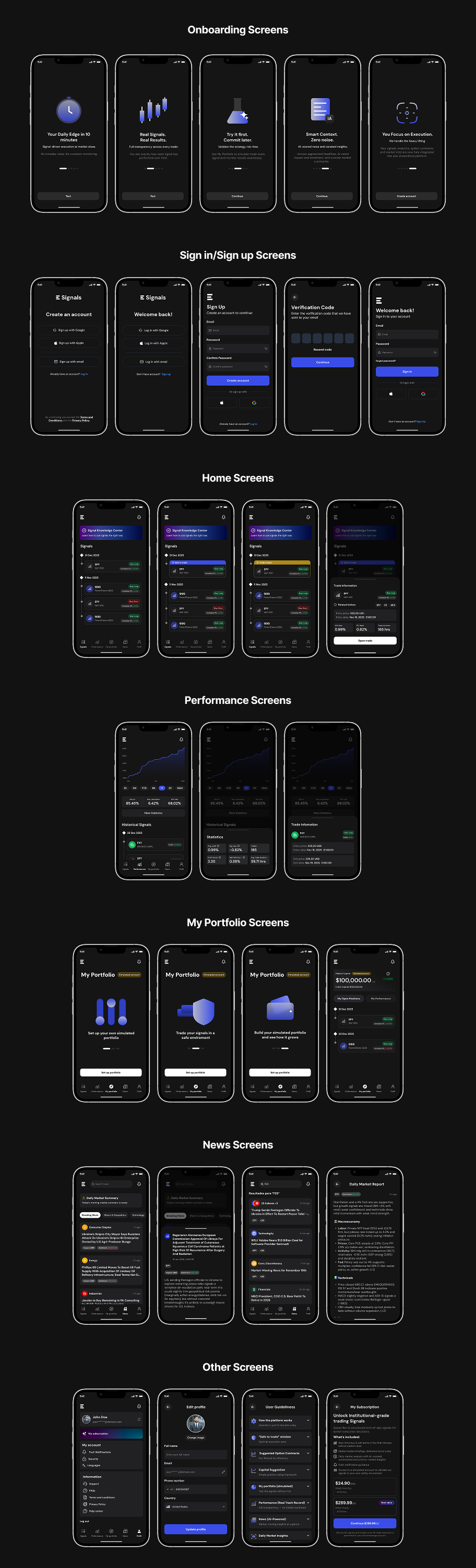
Design decision: The performance graph became the product's trust centerpiece, an immutable, auditable record of every closed signal. Once a signal closes, it is never edited. Users can see exactly how the performance curve was built, trade by trade. We also added technical indicators and informational labels at every point of potential confusion, a dedicated learning section, FAQs, and live support access. Transparency wasn't a UX detail, it was the brand strategy.

2. Communicating signal timing without creating anxiety

The biggest risk in a trading app is making users feel like they're constantly about to miss something. Users in early interviews consistently asked: "Can I still act on this signal? Is it too late?" because they couldn't tell from the UI whether a signal was still active or had already moved.

Design decision: We designed an explicit state system, Safe to open and Safe to close, as persistent visual badges on every signal card. Instead of leaving users to interpret timestamps and price data, the app tells them directly what they can do right now. This single system resolved the most common point of confusion across all user types.

3. A naming crisis in the simulated portfolio

"Paper trading" is industry-standard terminology, but our users weren't industry insiders. In usability testing, the term caused consistent confusion and disengagement. Some users didn't interact with the section at all because they didn't understand what it was.

Design decision: We renamed it Simulated Account, plain language that communicates exactly what it is. Then we went further: persistent "Simulated Account" badges appear throughout the section on every screen where a user might wonder if real money is at stake. This wasn't just a copy fix, it was a trust fix. Users needed to feel safe experimenting before committing real capital, and that safety required constant visible confirmation.

4. News for four very different readers

A first-time investor and an experienced trader read financial news completely differently. One needs context and simplicity. The other needs speed, sector filtering, and the ability to find specific information fast. A single flat news feed would serve neither well.

Design decision: We structured news with a clear hierarchy, breaking news first, with sector tags and related tickers visible before opening the article. Two AI-generated daily summaries, morning and afternoon, gave casual users a digest without requiring deep reading. Sector tabs allowed filtering for users tracking specific markets. A search bar, added directly from user interview feedback, gave experienced users the ability to find specific topics instantly.

What this project taught me

In financial products, clarity is a safety feature

Ambiguous UI in a trading app doesn't just frustrate users, it can cost them money or permanently damage trust. Every label, every state, and every timestamp had to be unmistakably clear. I learned to treat copy and visual states as risk-management tools, not just UX decisions.

Naming is product design

Changing "Paper Trading" to "Simulated Account" wasn't a copy edit, it was a product fix. What you call something shapes whether users understand it, trust it, and engage with it at all, knowing they're not risking money and can trade our signals in a safe enviroment. One of the most impactful design decisions in this project was a two-word rename supported by user research.

Design systems pay compound interest

Building a complete component library in the first week felt slow at the time, but it saved weeks of rework in the final sprint. In a two-month project with very little room for error, the design system became the highest-leverage investment I made.

Even informed users need absolute clarity

I learned that even when a product is designed for people with at least a basic understanding of finance, clarity still has to be a top priority. Familiarity with the subject doesn't mean users want to deal with unnecessary jargon or confusing data. A big part of the design work was simplifying language, removing information that didn't provide immediate value, and reducing anything that could create doubt, friction, or misinterpretation.

Back to home

Explore other projects

Portada del proyecto Api

Api

Study case

API is an app that helps you take care of your mental health while connecting you with a supportive community.

Read More
Portada del proyecto Nuno

Nuno

Study case

Nuno is a mobile platform designed to provide safe, reliable companionship and care for elderly adults in Venezuela.

Read More
Portada del proyecto KVN Design

KVN Design

Web redesign

KVN Design is a website redesign that transforms an interior design studio's portfolio into a refined editorial experience.

Read More