Minimalism Requires Strong Structure
A clean interface alone is not enough. Without a clear hierarchy, minimal design can quickly become confusing.
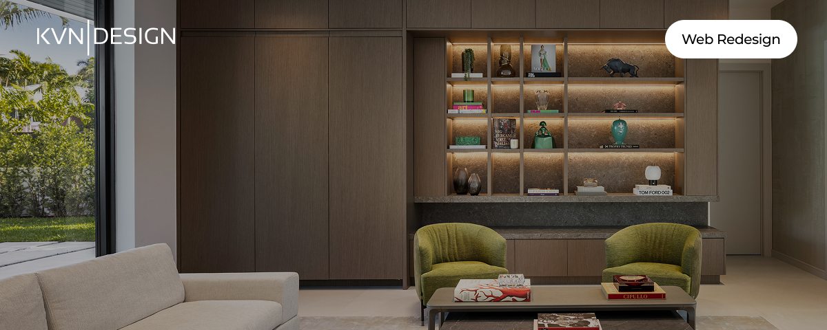
KVN Design is an interior design studio seeking to elevate its digital presence through a more refined and intentional portfolio experience. The original website showcased high-quality work, but lacked the structure and clarity needed to communicate the full value of the brand.
This project focused on transforming the website into a curated, editorial experience, one that balances visual storytelling with usability. Rather than introducing aggressive conversion patterns, the goal was to create a seamless and elegant browsing experience that reflects the studio's premium positioning while subtly guiding users through the content.
The client's primary goal was to present their work in a way that felt sophisticated, minimal, and non-intrusive. They wanted the website to function as a digital portfolio rather than a sales-driven platform.
However, the existing experience did not support this vision. While the visual assets were strong, the overall structure lacked cohesion, making it difficult for users to navigate, understand the scope of work, or take action when needed.
The challenge was to redesign the experience without compromising the brand's tone, ensuring that improvements in usability did not disrupt the elegance and simplicity the client valued.
The main objective of this redesign was to create a portfolio experience that:
Ultimately, the goal was to elevate both usability and perception, ensuring that the digital experience matches the quality of the studio's work.
This project required a careful balance between usability and brand expression.
From a UX perspective, the focus was on improving structure, reducing cognitive load, and creating a clear navigation flow. From a UI and branding perspective, the goal was to preserve the studio’s minimal and refined aesthetic.
Instead of optimizing for direct conversion, the design approach prioritized:
Every design decision needs to be made with the intention of creating an experience that feels effortless, where users can explore the work naturally without feeling pushed toward a specific action.
The initial audit of the website revealed several key issues that were affecting both usability and perception:
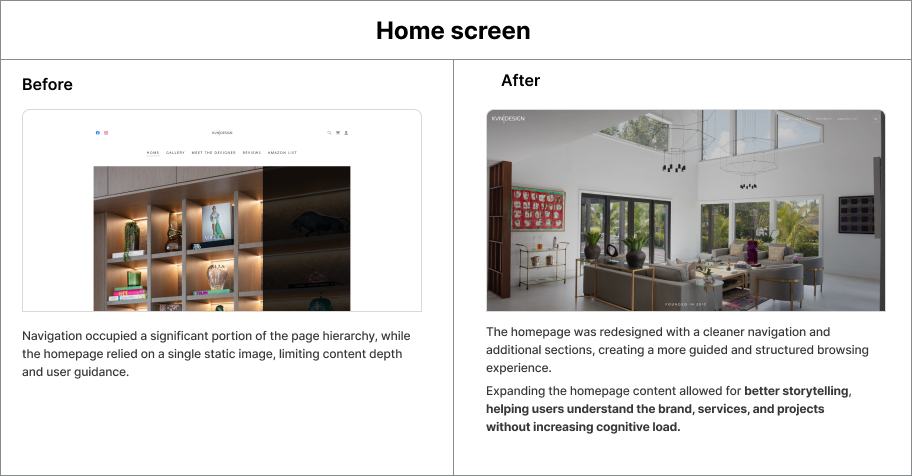
1. Lack of Content Hierarchy
The content was presented in a flat structure, making it difficult for users to understand the importance of each section or navigate the site intuitively.
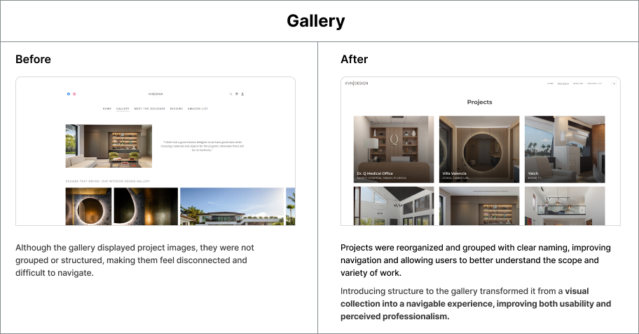
2. Unstructured Gallery Experience
Projects were displayed as isolated images without grouping or context, reducing clarity and making it harder for users to interpret the work.
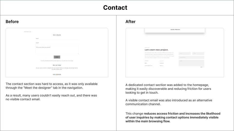
3. Limited Accessibility to Contact
The contact section was buried within secondary navigation, making it difficult for users to reach out or take action.
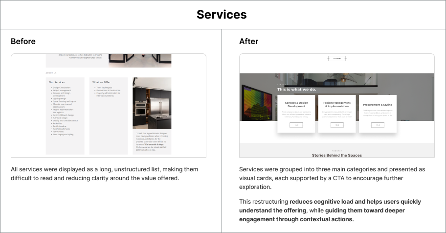
4. Overloaded and Dense Content
Certain sections, such as services and about, relied on long blocks of text, increasing cognitive load and reducing readability.
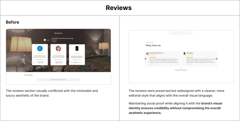
5. Visual Inconsistency
Different sections of the website presented inconsistencies in layout and style, weakening the overall perception of the brand.
To address these issues, the redesign focused on creating a more structured and cohesive experience.
The information architecture was reorganized into a clear narrative flow, allowing users to move seamlessly between sections. Projects were grouped and presented in a more structured format, improving both navigation and comprehension.
The homepage was expanded to include additional sections, providing better guidance and context without overwhelming the user. Services were simplified and grouped into digestible categories, making them easier to understand.
The contact section was brought into the main flow of the experience, reducing friction and making it more accessible.
Throughout the redesign, visual consistency was prioritized, ensuring that all elements aligned with the brand's minimal and refined aesthetic.
The redesign resulted in a more cohesive and intuitive experience, improving both usability and perception.
Key improvements include:
Although the design avoids aggressive conversion patterns, it creates a more accessible and engaging experience, which naturally supports user interaction and potential inquiries.
A clean interface alone is not enough. Without a clear hierarchy, minimal design can quickly become confusing.
In visual-driven industries, images are essential, but structure and labeling are what give them meaning.
Not all products benefit from aggressive calls to action. In premium experiences, subtle direction often leads to a more natural and engaging interaction.
A cohesive visual language strengthens the perception of quality and professionalism across the entire experience.

Study case
API is an app that helps you take care of your mental health while connecting you with a supportive community.
Read More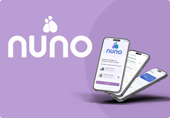
Study case
Nuno is a mobile platform designed to provide safe, reliable companionship and care for elderly adults in Venezuela.
Read More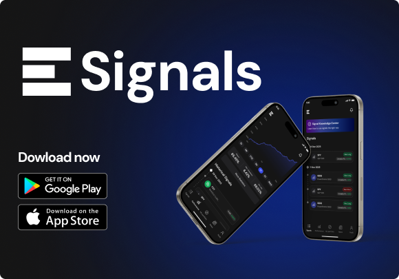
Project
eSignals is a mobile trading signals platform designed end-to-end for Envision Signals and launched live on iOS and Android.
Read More